Components
This page describes the syntax, styles and variable usage with all the components supported in Quick-FTXUI
1. Button
Button can be used to execute commands, like to exit the TUI, or to execute shell commands (bash & ps supported).
Syntax for defining a Button is:
[color] Button {
  "[Button_label]",
  [command],
  [Button_style],
  [variable_name]
}
where,
coloris used to give color to the ButtonButton_labelis the label given to the buttoncommand, which can be"Exit", or aSystem()call.Button_style, which can be Animated or Ascii. Its an optional parameter.variable_name, where the variable is of typestr. IfSystem()call is used, then variable has to be defined necessarily.
Now, lets take a look at some examples, which will depict all the styles and commands which we can execute
-
Basic button, to exit the UI
Button {
  "Exit",
  "Exit"
}
which looks like this:

-
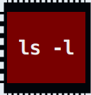
Red Animated Button, to list the items in the current directory
str z = "init"
Red Button {
  "ls -l",
  System("ls -l"),
  Animated,
  z
}
which looks like this:
-
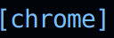
Blue Ascii Button, to open chrome (in at least Ubuntu)
str z = "init"
BlueLight Button{
  "chrome",
  System("/usr/bin/google-chrome-stable"),
  Ascii,
  z
}
which looks like this:
Now we will see all these buttons in action:
You can find the complete example here: Button.qf
Note: Since we used the same variables for both the Buttons, the output from their commands were both reflected in z's value.
2. Slider
Slider is used to select a numerical value between a specified range.
Syntax for defining a Slider is
[color] Slider {
  "[Slider_label]",
  [variable_name],
  [range_min],
  [range_max],
  [step]
}
where,
coloris used to give color to the SliderSlider_label, which provides the label for the slidervariable_name, where the variable is of typeint, and stores the selected valuerange_min, which specifies the minimum value of the rangerange_max, which specifies the maximum value of the rangestep, which specifies the step value by which the slider's value will increase or decrease
Now, lets take a look at some examples, which will depict how Sliders can be configured and used
-
A Blue Slider, for choosing any value between 0 and 100
int x = 5
Blue Slider{
  "Slider 1: ",
  x,
  0,
  100,
  1
}
which looks like:

-
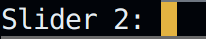
A YellowLight Slider, for choosing any even number between 0 and 100
int y = 40
YellowLight Slider{
  "Slider 2: ",
  y,
  0,
  100,
  2
}
which looks like:

Lets look at these sliders we have defined in action:
As we can see, the YellowLight Slider was progressing faster than the BlueLight one, as its step value was greater.
You can check out the full example here: Slider.qf
Note: Avoid using Sliders in Horizontal blocks, as it results in its compaction like described below
(The slider is at its max range)
3. Input
Input is used to access textual inputs from the user.
Syntax for defining an Input is:
[color] Input {
  "[Placeholder]",
  [Input_Option],
  [variable_name]
}
where
colorcolors the input field and the text inside (if any)Input_Optioncan either beNoneorPassword. If not specified, defualt isNone. InPassword, the input text (while in the TUI) is hiddenvariable_name, which is of typestr. If not specified, script will raise error
Now lets explore some examples
-
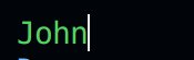
A GreenLight Input, with initial value of "John"
str f = "John"
GreenLight Input {
    "First Name....",
    f
}
which renders like:
-
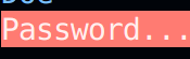
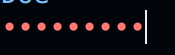
A Red Password field
str p
Red Input {
    "Password....",
    Password,
    p
}
which looks initially something like this:
and with text looks like:
Now lets see an actual demo:
You can check out the full example here: input.qf
4. Dropdown, Toggle and Menu
Dropdowns, Toggles & Menus are used to present a list of options to the user to choose one from. They all have similar syntax, the only difference between them is their representation.
Syntax for defining a Dropdown is:
[color] Dropdown {
  ["list_item_1", "list_item_2", ... , "list_item_n", ],
  [variable_name]
}
where,
colorwill be applied to theDropdownlist_item_irefers to the options that will be given to the uservariable_nameof typeint, to store option no. selected. Do note that the option numbers start from0
Syntax for defining a Toggle is also same
[color] Toggle {
  ["list_item_1", "list_item_2", ... , "list_item_n", ],
  [variable_name]
}
Syntax for defining a Menu is same, except for Option for Menu
[color] Menu {
  ["list_item_1", "list_item_2", ... , "list_item_n", ],
  [Menu_Option],
  [variable_name]
}
where,
Menu_Optioncan beVertical,Horizontal,HorizontalAnimatedandVerticalAnimated. TheAnimatedoptions have transition while switching between the options.
Lets look at some examples for the same:
-
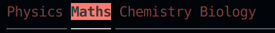
A Horizontal Red Menu, with animated tranistions between the options
int x
Red Menu{
  [ "Physics", "Maths", "Chemistry", "Biology",],
  HorizontalAnimated,
  x
}
which looks like this:
-
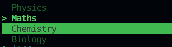
A normal, Vertical Green Menu
int a
Green Menu {
  [ "Physics", "Maths", "Chemistry", "Biology",],
  Vertical,
  a
}
which looks like this:
-
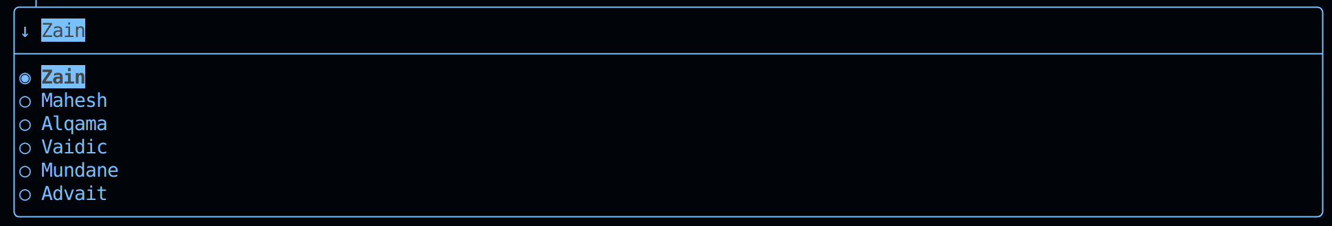
A BlueLight Dropdown
int z
BlueLight Dropdown {
  [ "Zain", "Mahesh", "Alqama", "Vaidic", "Mundane", "Advait", ],
  z
}
which looks like this:
-
A Cyan Toggle
int y
Cyan Toggle {
  [ "On", "Off", ],
  y
}
which looks like this:

Now lets take a look at how these components work:
You can check out the full example here: menu_toggle_dropdown.qf