An Overview
In this page, the general working of the language is described
1. Understanding the Structure of the language
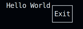
Lets start with a simple example, where we will write a Hello World program with a button to exit the UI
The code will look like this
Vertical{
  Text("Hello World")
  Button {
    "Exit",
    "Exit"
  }
}
The output:

Lets look at this step by step
- The block
Vertical { ... }is the main block of the script. All the components, DOM elements (in our case, Text() and Button) and nested blocks, come inside this block.
If Vertical is switched with Horizontal, The UI changes to this
Horizontal{
  Text("Hello World")
  Button {
    "Exit",
    "Exit"
  }
}

Note: Its necessary to specify the alignment of the block, else the code will not execute.
-
The Text() is a
DOM element, meaning it defines the structure of the UI, and is used to describe the content on it. -
Button{ ... }is a component, which is used to exit the UI in this case. Components can be used for getting user inputs, in variety of formats, like dropdowns, toggles, etc.. Buttons can also be used to execute System calls to the host OS.
Now lets look at how we can accept and extract user inputs from our terminal user interface.
2. Variables
Quick-FTXUI has two data types: int & str.
intis used for storing numbers, like the option no. in Dropdownstris used for storing text-based inputs, like in case of Input
Syntax for defining a variable is:
[data_type] [variable_name] = [value]
Where variable names follows similar naming conventions to other popular languages. Its not mandatory to initialise value of a variable. By default, its assigned 0 (in case of int) and empty string "" (in case of str).
Now, lets look at an example to utilise the variables we defined
We will modify the Hello World script to ask for user's preferred programming language, using a Dropdown
(Note: To learn more about Dropdown, please refer to the Components documentation)
Vertical{
  Text("Hello World")
  int z
  Dropdown {
    [ "C", "C++", "Python", "Javascript", "Java", "Rust", "R", ],
    z
  }
  Button {
    "Exit",
    "Exit"
  }
}
The option no. (which starts from 0) will be stored in the variable defined with the name z.
The output is:
As we can see, the int variable z had a value of 4 after the execution of the UI is over, which signifies the option number 4, i.e, Java, in the Dropdown. Do note that it is necessary to define (or initialise) the variable before using it in a component, else the error will be thrown indicating that the variable is not found.
The syntax for interfacing variables with components is different for each component. Please refer to the section for Components in the user manual for understanding syntax and working of each component.
3. Components
As we discussed above, Components are a vital part of the TUI, and are used for interaction with the user.
- Users can navigate & choose from options , in case of
Dropdown,ToggleorMenu - Users can enter text-based content, in case of
Input - Users can also select a numerical value between a particular range, in case of
Slider - Execute command(s), like exiting the UI, in case of
Button
Lets take a look at a glimpse of these components:
The general syntax for defining a component is:
[component_name] {
  params...
}
For example, lets consider the above example, where we used a Dropdown
Dropdown {
  [ "C", "C++", "Python", "Javascript", "Java", "Rust", "R", ],
  z
}
As we can see, it takes two parameters:
- A comma separated list of options, enclosed in square brackets (
[]). - The integer variable, which will be assigned the option number selected
Do note that lists, in general, should end with a comma, otherwise, the code will fail to execute. Also, their indexing, like most programming languages, starts with 0.
Components also have variety of different options to display them in the UI. For learning more about the syntax of components, please refer to the Components section in the user manual
4. DOM elements
DOM elements, which derive their name from the Document Object Model used in making webpages (like this one), are used to define or describe the structure of the UI.
Border, which, as the name suggests, adds border around blocksseparator, which is used to act as a divide between components and nested blocks in a blockText, which is used for small texts, but don't adapt to the size of the terminal windowParagraph, which is ideal for large texts, and does adapt to the size of the terminal window.
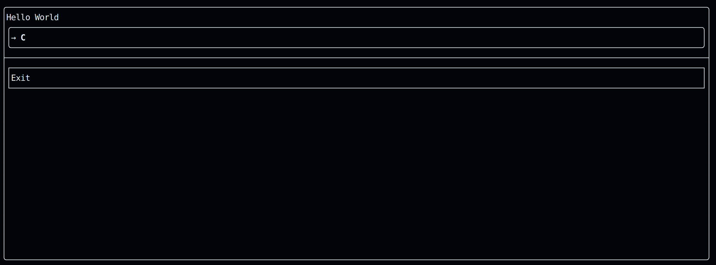
Lets take a look at a glimpse of these DOM elements, by adding some in our Hello World example. We will add a border around our main block, and add a separator between the Exit button and the Dropdown.
The modified code is:
Border Vertical{
  Text("Hello World")
  int z
  Dropdown {
    [ "C", "C++", "Python", "Javascript", "Java", "Rust", "R", ],
    z
  }
  separator
  Button {
    "Exit",
    "Exit"
  }
}
The output is:

There are also different styles to all the DOM elements, which you can learn about in the DOM section of the user manual.
5. Color
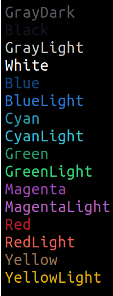
Quick-FTXUI currently support the givne below, 16 color pallete. Support for a more wider range of colours is coming soon.

Note: The second color is Black, which is faintly visible against the black background.
To apply color to a component or Text or Paragraph, the general syntax is:
[color] [Component | Text | Paragraph] {
  [params]...
}
Please refer to the syntax specific component for knowing how to apply colour to them.
6. Nesting of blocks
As we discussed in the first section can also nest blocks, meaning we can manipulate selectively the alignment of various components of our UI.
For example, lets add a Button for listing out the files & directories in your home directory. We will align it horizontally with the Exit button
The modified file will be:
Border Vertical{
  Text("Hello World")
  int z
  Dropdown {
    [ "C", "C++", "Python", "Javascript", "Java", "Rust", "R", ],
    z
  }
  separator
  Horizontal {
    str x
    Button {
      "List out files & directories in root",
      System("ls ~/"),
      x
    }
    Button {
      "Exit",
      "Exit"
    }
  }
}
The output is:
You can refer to the final Hello World example here